Showing posts with label paintings. Show all posts
new work by Jacob Kassay

"Here the new work also surprises with groupings of canvases in blush tones and pure silver deposit, using similar minimal restraint yet differing in scale, shape and tonal variation. "
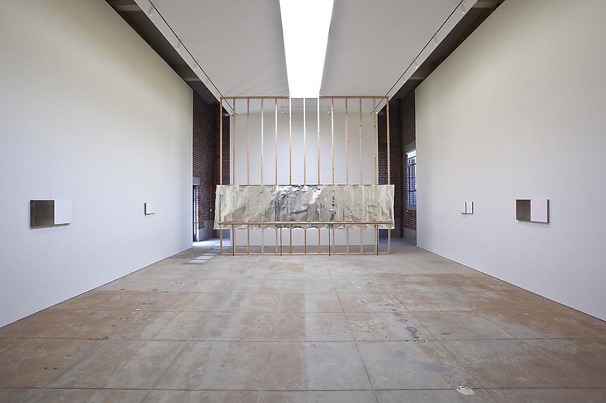


L & M Arts
Venice, CA
July 21 - September 2, 2011

"In this exhibition, Kassay continues his dialogue with color field and minimal painting, while additionally considering and creating a unique environment for these works to inhabit.

Kassay’s previous silver paintings used depth, light and relief to activate the spaces they were presented in. These shimmering surfaces have a surprising yet deliberate absence of reflection as well as hints of deposit where the silver oxidized to reveal brown, reminiscent of Yves Klein’s fire paintings. Here the new work also surprises with groupings of canvases in blush tones and pure silver deposit, using similar minimal restraint yet differing in scale, shape and tonal variation. New to the work is that its purpose and placement is meant to suggest dancers in a ballet studio or a choreographed performance. A large silver work on paper with a ballet barre placed in front of it operates as a visual anchor with the smaller works dancing around it.

This installation conceit engages Kassay’s interest in artist collaborations such as Rauschenberg and Johns designing sets for Merce Cunningham performances and an abundant history of multi media collaborations. It evokes these ideas, but also takes into consideration the gallery as a place for practice, repetition and the natural gradients provided by the light, the white walls and the work itself."


-------------------------
Los Angeles: 4 paintings
November spawned a monster.


For those that delight in painting, Los Angeles
is a lucky place to live this month.
maple leaves, and kool-aid delusions.


Joan Mitchell,
Maple Leaves Forever 1968
at Gagosian, Beverly Hills,
now till Nov 6... "Masters of the Gesture."


Katharina Grosse

Mr. Caplan, Nov 6 2010 - Jan 8 2011,
Christopher Grimes Gallery, Los Angeles

(she's back in LA! seems she might be working on the canvas
and not the walls this time around....
)


Kyle Field November 6 – December 18, 2010

Taylor De Cordoba is pleased to present Waxing Marks, an exhibition
of new works on paper by San Francisco-based artist and musician, Kyle Field.


Tyler Vlahovich

I Drank the Kool Aid November 5 - December 4
at WPA Los Angeles....


Los Angeles: painting

November spawned a monster.

For those that delight in painting, Los Angeles is a lucky place to live this month.
maple leaves, and kool-aid delusions.


-----------------
Sylvia Sleigh
1916- 2010


I wanted to give my perspective; portraying both sexes with dignity and humanism.
I don’t mind the ‘desire’ part, it’s the ‘object’ that’s not very nice.

- Sylvia Sleigh

(repost from here.)


"Sylvia Sleigh, a British-born artist who put a feminist spin on the portrait genre by painting male nudes in poses that recalled the female subjects of Ingres, Velázquez and Titian,
died on Sunday at her home in Manhattan. She was 94. "

via here, and here...


"Sylvia Sleigh, 89, is best known for her valiant effort in the 1970's to institute a new genre of feminist painting by changing the gender of the traditional odalisque. Whether because of her limitations as a painter or some deeper sociocultural resistance, the idea never took hold.

Today her flatfootedly realist pictures of young, beautiful, extravagantly long-haired nude men in states of voluptuous relaxation remain fascinating artifacts of their time. Like other things about the 70's, they are embarrassing, unintentionally comical and oddly creepy, yet they remain somehow touching in their quixotic ambition to establish a new humanely erotic tradition for the heterosexual female gaze."


taken from NYT here..


-----------------------------
matt connors
new work
at Canada!


installation of current show, You Don't Know.


"Some of these emblems are gleaned from everyday usage and seem oddly familiar. Some of them are mysterious and open the door to the possibility of private meanings. Exploring the idiosyncrasies of personal vision while directing the viewer in a loose, yet insistent way, Connors’ paintings elicit an emotional and visceral response while at the same time allowing for a range of intellectual questions. It has been suggested that Connors’ pictures are not so much abstract paintings as paintings of abstract paintings. In some sense this is true, yet, at the same time, Connors' paintings have a not-to-be overlooked handmade aspect that thoroughly grounds viewer and object in their own space."


- taken from cherry & martin, here...


new work matt connors

You Don’t Know,
October 22 – November 21

at Canada Gallery


2011
Dallas Museum of Art, Dallas, TX (upcoming)
Lüttgenmeijer, Berlin, Germany (upcoming)


-------------------------
when paintings
become buildings.


when paintings
become buildings.


1. Conrad Marca-Relli, 1913 - 2000, painter
2. Coop-Himmelblau, go here!, Los Angeles, High School. From my office chair, I can see this high school!

"The future society will be a society of knowledge. We believe that the knowledge of the future will not be found within closed disciplines any more but rather at the intersection points between different fields of knowledge, such as the sciences, arts, economics and ethics. Timely education for the future therefore has to offer possibilities of crossings between different fields of knowledge.

This is where High School #9 positions itself as a new flagship high school which includes the arts in public education and offers courses in the visual and performing arts next to the general education of language, mathematics, sciences and history. "


------------------------------
Blinky Palermo: Retrospective : LACMA
Los Angeles County Art Museum
1964–1977
October 31, 2010–January 16, 2011


"While Blinky Palermo’s reputation as one of the foremost post-war abstract painters is well established in Europe, his work is rarely seen in North America. Beginning its yearlong tour at LACMA, this is the first comprehensive retrospective of the work of this German artist in the United States."

go to LACMA for more.

Conversation: Lynne Cooke,
Mathias Poledna & Rhea Anastas

Tuesday, October 26 | 7:30 pm
(I'll def be going to this!)


"Blinky who died mysteriously at 33 years old,
continues to haunt the art world...."


"Shortly before his death in 1977, German painter Blinky Palermo created his most significant cycle of paintings, dedicating it "to the people of nyc." The work consists of 15 parts, composed from 40 painted aluminum panels arranged in combinations of cadmium red, cadmium yellow and black.

Recalling Piet Mondrian's late series New York City (1941-42), and works by such American artists as Robert Ryman and Brice Marden, To the People of New York City (1976) is distinguished by its prescribed hanging and pacing, and its rhythmically changing formats, which also bring to mind the Jazz performances that Palermo sought out during his time in New York, where he had maintained a studio from 1973 to 1975.

This handsome edition discusses To the People of New York City--today in the collection of New York's Dia Art Foundation--within this context and alongside works by his former teacher Joseph Beuys, and his long-time friends and colleagues Imi Knoebel and Gerhard Richter, among others."


Blinky Palermo: To the People of New York City
Text by Lynne Cooke, Anne Rorimer, Pia Gottschaller, Jaleh Mansoor.


book via ARTBOOK, go here to
see more of their catalogue!


---------------------------
melissa
manfull,

pattern
constraints


MELISSA MANFULL:
Pattern Constraints

September 18 – October 23, 2010


"Seeking inspiration from metaphysics and mysticism, Melissa Manfull creates hyper-detailed structures that straddle the worlds of reality and imagination. Working in a palette that ranges from the subdued and earthy to the mystical and otherworldly, Manfull inserts her stiff geometric shapes within pools of bleeding ink. Thus bringing to mind the idea of a building’s lost limb, detached and floating in space.

The artist’s interest in utopian societies and the ways in which architecture can reflect belief systems inspired these organic yet repetitive drawings. And in some ways, the resulting structures, created by fractal patterning, reflect the artist’s personal understanding of the intricate workings of the universe and the mind. Due to the obsessive nature of her process, Manfull has often viewed the meditative act of drawing as a way to approach her fear of vast, open ended space (the unknown). By creating her minute sculptural drawings, she gives this abyss a meaning and in essence, gains control. With her amorphous ink stains, she tries to mimic this emptiness rather than flight it."


melissa manfull,
pattern constraints

at taylor de cordoba,
culver city, los angeles


-------------------------------------


Fall, Art Calendar:
Los Angeles


Eva Hesse,
rarely seen paintings


As summer comes to a slow fade, I'm beginning to get excited about some upcoming
art / design shows that will be opening very soon in Los Angeles.
New work by Los Angeles artist Carlee Fernandez at ACME!, Richard Aldrich at Marc Foxx with "Slide Paintings."


First up, Eva Hesse at the Hammer Museum.

September 25 - January 2, 2011

"The Hammer Museum presents Eva Hesse Spectres 1960, an exhibition of seminal and rarely seen paintings by legendary artist Eva Hesse (1936-1970). Created when Hesse was just 24, this group of nineteen semi-representational oil paintings stands in contrast to her later minimalist structures and sculptural assemblages, yet constitutes a vital link in the progression of her work. While several recent museum exhibitions on Hesse’s work have featured a few of these paintings from 1960 however none have considered these works as a group all together. This timely reassessment of Hesse’s career furthers an understanding of her artistic contributions.

Organized by E. Luanne McKinnon, Director of the University of New Mexico Art Museum, Albuquerque, the exhibition focuses on what McKinnon terms Hesse’s “spectre” paintings for their haunted interiority and attempt to embody emotional states in abstract form.

As McKinnon notes, “Looking inwardly and outwardly and with paint as her guide, she began to paint herself out and away and ahead…The procession of paintings under examination here represents a rupture that, once completed (not as a formal solution but rather as a psychological denouement), settled back into solving the problems presented in abstraction, eventually evolving into the constructions that Hesse is lauded for.”


go to the hammer museum here..


--------------------

COLOR STUDY FOR A NEW ROOM.

the darkness
will lead
us home.


---


"A colour is transparent or opaque, lighter or darker, pure or broken, ex or introverted. To these measurable qualities come the sensations that they cause, which are affected by individual associations.

The factors which affect these qualities allude to the interplay of material and structure, of size, format and position in space, of what is meant and not meant."


---


"the darkness will lead us home"

two paintings:
1. Caro Nieder,"View fro the Pink Sofa" 2009 c/o Hauser and Wirth
2. Emanuel Seitz, Untitled 2010 c/o Jacky Strenze Galerie

A possible yellow.

2 paintings
and an
interior shot.


2 paintings
and an
interior shot.


1. george morrison, painting.
2. unknown interior.
3. joshua abelow. go here! full interview this week on YHBHS.


George Morrison has the distinction of being the only Native American artist that has been recognized as an American artist. He abstract style was nurtured at the Student Art League in New York City, where he was a participant during the 1940s. Although he has chosen to work in an abstract style, he has drawn from his childhood memories of growing up on the northern banks of Lake Superior. Often his work references the horizon line, a powerful connection to the land, the water and the sky.

The horizon line as a recurring theme provides structure and identity to his work and has become his signature.


-------------------------

Arshile Gorky

the last
painting
1948


The Last Painting
, 1948
Oil on canvas


A short time after his studio burned, Gorky underwent a painful operation for rectal cancer. In June 1948, he was badly injured in an automobile accident which temporarily paralyzed his painting arm. Alarmed at Gorky’s increasing melancholia, his wife took their two children to safety, leaving him in a suicidal spiral that ended with the tormented artist hanging himself on July 21, 1948.

As he prepared to take his own life, Gorky wrote in chalk on a wooden crate, “Goodbye My Beloveds.” The word “beloved” was well chosen. Gorky was a man and an artist who evoked love in his work and in his life. Willem de Kooning, his great friend, called him “Sweet Arshile.”

--------
Starting in 1946, however, Gorky had a run of bad luck: a year’s worth of paintings and drawings were destroyed in a fire; an operation for cancer forced him to use a colostomy bag; his wife had an affair with his best friend; he even broke his neck in a car crash, temporarily paralysing his painting arm. Gorky became horribly depressed. In the summer of 1948, he hanged himself in a shed.


all text taken from here
and here...

Bernard Frize b. 1941
N. 76 2005
acrylic and resin on canvas
via wrightauctions.


"Frize's art is about painting itself, i.e. not about painting as a medium to express feelings or depict fragments of reality. Throughout Frize's oeuvre, we notice how the artist studies the genesis of the various aspects of the painting.

Already in the 1950s the American critic Clement Greenberg stated that the artist should attempt to find the inherent qualities of each medium. In painting this was supposed to be 'flatness': the flat character of the support, of the canvas. In the monumental paintings of the abstract expressionists this aspiration culminated into a climax, according to Greenberg. Yet the works of painters like Pollock, Rothko or Newman are not merely about applying colour to the flat support. In their work, these artists want to convey a certain feeling, they try to create some sort of impression: In short: they want to achieve some goal Unlike them, Frize wants to eradicate every personal decision.


When Frize pours paint onto the canvas, he has not reflected in advance about the result. Unlike the abstract expressionists, too, he does not choose deliberate combinations of colours and he declines to use meticulous 'drippings' or a handwriting based on a calculated abstraction. For every series of paintings, Frize uses a different technique. For Frize, painting is not a 'medium' to express something. The painting paints itself."


from esssay by Eva Wilcox.


----------------

painters.

Katharina
Grosee


"Grosse makes canvas of architecture, erecting varicolored walk-abouts by using hundreds of litres of spray paint; mounds of earth; mammoth, leaning discs; and other big, wadded-up shapes. Viewers are not allowed any of the usual aloofness in their relationship to the artwork, as they literally walk through an airbrushed terrain. That status quo is dissolved. At once dreamy and seemingly protean, the space still renders you surefooted but takes your wit from you, bringing you into an unfettered realm.

Appropriately, all of her installations are a one-time deal—they are site-specific and short-lived, as if reveries."


Bernard

Frize


"Near the end of the 1970s Bernard Frize decided to devote himself to painting. Any other decisions he left in large part to the idiosyncrasies of the medium. Already with his early work Frize burst the cult of the artist as a creator. In his view, the artist is not above anyone else: he is merely a 'labourer' who produces paintings. Frize bought template rolls with figurative shapes he applied on the canvas.

With the smallest brush he could find, he patiently filled in a canvas measuring one square metre with short brushstrokes. Frize's painting is based on technique and movement. He does not believe in personal expression, communicating a message or political statement. He wants the medium itself to speak, to purify painting, to peel painting until only its bare essence is left: paint, tools, the technique of applying paint on the canvas. Simple methods determine the motif or pattern.
"


--------------

YHBHS Interview with Jeffrey Scott Mathews

....
"The new (ancient) age"


Untitled (/x\) 2010


I think it was one night not too long ago. Late, late into the night, when I first
found myself staring at Jeffrey Scott Mathew's paintings. Maybe my eyes were exhausted from staring at the screen, but Jeffrey's paintings seemed to be melting in front of my eyes. Perhaps it was Max Richter's score that was lulling me into a dream state, or maybe it was just the hour.

Their lines blurry, and fuzzy, bouncing upon the surface almost like an analogue melodic beat might. Their strong geometric lines reminded me of fantastic wallpapers, or some
sort of psychedelic tapestry that would be draped over a chair.


Yet their painted surfaces seem to be destroyed with these metallic puddles of good(evil)ness!?!


Bi83, I wondered wtf?
and Binary rainbows,and twilight thinkers, I was hooked!
Sign me up for this afterlife, please.


-----------------


Untitled (Drctnl Decomposition), 2010


What is bi83 and marker bleed? Will you talk about your process for making this series of work? Bi83 is the name for the heavy metal bismuth as it is found on the periodic table of elements. Bismuth has a rich cultural history as both a metaphysical healing property and as an element with many commercial applications(it is the active ingredient in Pepto-Bismol). The reason that I choose to work with the material is that it forms stair-step or hopper crystals as it cools. It has a low melting point so it is possible to drip and draw with the material on linen or canvas. As the molten metal cools, crystals form and the material forms a bond with the linen. I appreciate the component of organic structure occurring after chaotic and almost expressionistic gestural painting.


Untitled (Binary Rainbow), 2010


The marker-bleed refers to my use of markers on linen that are compromised by water or chemical agent, allowing the pigment to bleed and saturate into the linen. I see this as another level of the process or systemic organization being disrupted by natural phenomena. Due to the fact that I work with chance there is always a high possibility of failure. This makes things both exciting and precarious as I am constantly building things up in order to break them down. I think this collaboration with nature is vaguely reminiscent of my background in experimental processes with photography.

The work is both a recording and an experiment. Ultimately, each work is the residue of an ongoing investigation with infinite possibilities.
who are you inspired by? I'm heavily inspired by the sort of formal enthusiasm typified by late 60's minimalism where artists were working with space-age industrial materials in order to subvert their function within the military industrial complex. I'm also inspired by the science fiction writing of JG Ballard and his elemental cycle, which encapsulates positivist ideas about geophysical change and its relevance to psychological transformation.


You seemed to be drawn toward the 11 x 14 format. Any particular reasons?
I feel like the scale of an 11x14 inch painting makes it more personal and less monumental. I am not opposed to monumental works, but the scale seemed appropriate for the intricacy of the crystals that form on the surface of these paintings. I am, however, constantly learning new ways to manipulate the bismuth, so I think a scale upgrade will occur when I am capable of cultivating larger crystals. As the means of control grow, so grows the system.


Untitled (Scapeland), 2010


Is your home messy or neat?
I live in an apartment in Brooklyn with my girlfriend who is also an artist. We keep things neat when we can, although she is in the early stages of initiating a rooftop garden, so dirt is everywhere.

I also work from home, so my studio vacillates between being organized and efficient and adversely sloppy and crystal laden, much like my paintings!


Talk about twilight thinker, and binary rainbow... where do you titles come from?
I title the works "Untitled" with parenthetical titles for descriptive or reference purposes. The referential titles are sometimes formally descriptive, and sometimes arbitrary. "Twilight Thinker" is actually a chapter in (Anti-) philosopher Emil Cioran's book "A Short History of Decay", which I am currently reading.

In this chapter Cioran states " Finding ourselves at a point symmetrical to the agony of the ancient world, a victim of the same sicknesses and under similarly ineluctable charms, we see the great systems destroyed by their limited perfection... We have come with our own death to the doors of philosophy: rotting on their hinges, having nothing more to protect, they open of their own accord..."


If you could have one dream next door neighbor, who would you want to move in next door?
I think my dream neighbor would have to be either tolerant of noisy drone music or deaf, because my current neighbors are definitely not down with the kind of music i listen to. Maybe I would want the neighbor to be an intellectual musician Tony Conrad, Terry Riley, or Steve Reich. Music is important to me because it is all process. I like experiential sounds that inspire a sort of be-here-now existentialist state of mind. So, yeah some kind of new age person...


------------------------


thank you Jeffrey for having this conversation!
see more of Jeffrey Scott Mathews' work here..


-------------------------------

ALICE NEEL : Los Angeles

I like it not only to look like the person, but to have their inner character as well,
and then I like to express the Zeitgiest.


-- Alice Neel


Alice Neel:
Paintings In association with Jeremy Lewison Limited
20 May - 26 June 2010
Opening reception, Thursday, 20 May, 6 - 8 pm


"Fiercely independent, free-spirited, and working at a time when figurative painting was unfashionable, Alice Neel pursued her art fearlessly. Painting in relative obscurity into her 60s, Neel received acclaim late in life, and is now valued as one of the most important American painters of the 20th century. Neel’s subjects were her sons, grandchildren, friends and acquaintances, art world figures, and sometimes people she encountered on the street. While some of her sitters were, or became, people of renown, most were simply those who caught her eye.


In her art, Neel sought to convey the individual, and to reveal their inner life. Neel described the experience of painting: “I become the person for a couple of hours, so when they leave and I am finished….I have no self.” As Lewison states, “Neel entered into them, exploring their folds, creases and idiosyncrasies with her brush, sculpting them as though they were extensions of herself.” Neel’s paintings are imbued with a powerful understanding of her subject within an incisive temporal and social context.


Alice Neel:
Paintings In association with Jeremy Lewison Limited
20 May - 26 June 2010
Opening reception, Thursday, 20 May, 6 - 8 pm

At LA Louver Gallery


---

The best
way
out is
through.


" Chance of course plays its part,
dictating the way in which different dyes
will react and determining the extent of irregularity
in the the staining at the rings' edges."


The best way
out is through


1. michael phelan, the best way out is through (No. 18),
2006 Dye on linen..
here
2. michael dopp, kinkead contemporary, here..


"The considerable size of the works is rooted in the Abstract Expressionist heroism of Jackson Pollock, Barrnett Newman, and those that followed them, while their palette abandons the acidic psychedelia traditionally associated with tie-dye imagery in favour of the lyrical hues reminiscent of Colour Field artists such as Morrris Louis, Helen Frankenthaler and Kenneth Noland. Continuing the experiments begun by Turner, Kandsinsky and Albers, this latter group was interested in the atmospheric effects of colour, enveloping the viewer in an impersonal and unashamedly two-dimensional environment on a monumental scale.


The dominant motif in each of Phelan's works, a target, is similarly borrrowed from the Color Field lexicon, specifically the paintings made by Noland between 1958-62. They were not intended to be read as targets per se, unlike those that Jasper Johns was producing at around the same time. Rather, the target functioned as it had several decades earlier in the work of Robert Delaunay: as a purely formal device, devoid of narrative or overtly personal expression and well suited to the artist's investigations into abstraction."


----

New Work


west coast
east coast.


_____


perfect
mismatch

________


Ken Weathersby
28 May, 2010.
Exhibition Dates
28 May - 27 June, 2010


PIEROGI
177 North 9th Street,
Brooklyn, NY


Ken Weathersby's solo show at Pierogi!
If in New York, don't miss this show.
These paintings are beautiful and sublime online,
but the work sings in person!
If you are in Los Angeles in the next month,
Ken's work is at LACE, as part of
the 2010
auction.


----


go to ken weathersby
site here

C h r i s M a r t i n

chris
martin
at
daniel
weinberg
may 1 - may 29


CHRIS MARTIN
Tree
1986-2009
Oil on canvas 38" x 24


----


"It's like being inside and outside at the same time. On the one hand you are in trance, on the other hand you are watching yourself paint. And I think the key is that when you are watching yourself paint you don't judge, you just watch. The less I judge the more I can actually create and see what I'm doing. "


-------


"I wish we could all wish for not knowing what we are doing. But in a good way. I think there's a sense of freedom that comes from everybody not being too sure what they're doing. Someone once said about New York in the early 1950s, late '40s, after Expressionism was sort of bursting onto the scene, "There was a moment, maybe six weeks or so, when no one had any idea how to make a painting." And that's a lovely idea, that we don't know what we're doing…"


(I missed the show last summer at Micthell-Innes and Nash,
but really excited to see Chris Martin's work here in Los Angeles.)


Chris Martin....


-------


2
paintings


2
paintings

1. ronnie hughes, c/o rubicon gallery here..
2. nicholas pittman, fourteen gallery portland here.


"Hughes is interested in networks of analysis, methodology and interpretation. He feels that these new works share with their geographical source of origin a connection to a certain ‘enlightenment’ sensibility – a desire to uncover an underlying order in the apparent chaos of nature.

The works take the form of corrupted abstractions that investigate, and at times conflate, various dichotomies e.g. natural/synthetic, order/entropy, abstraction/mimesis, nature/nurture. Hughes sees his activity as constructing (or, possibly, ‘exposing’) order within closed evolutionary systems that each conform to their own improvised sets of rules or conditions."


----

LAMA May 23, 2010

run,
don't
walk!


John McLaughlin

Untitled (#33) 1958 Oil on board Verso
"John McLaughlin #33- 1958 The Landau Gallery"
Provenance: Felix Landau Gallery


----------


run, don't walk!
or should i say, click, and click quickly!
(hint, click the rug below for the link!)
whatever works, the new
LAMA Auction is up
and its killer..


The Preview is
May 15 - 22 Preview Open!
Anyone want to join me?


Ilya Bolotowsky

Area rug
designed circa 1970
Wool rug
Signed in selvidge
84"diameter


tons
more beautiful
items on
the LAMA site.
p.s. don't forget to check out
LAMA's blog... here..


----------------------