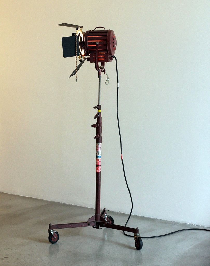
"During the assembly of the show I was channeling Jean Des Esseintes, the main character in Huysmans' A Rebours. Des Esseintes is a the last living member of a noble family and becomes so disgusted with his decadent life in Paris and decides to move to the countryside to spend his life in intellectual and aesthetic contemplation." - Daniel Balice
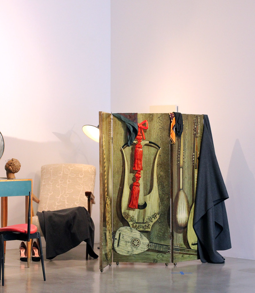
Piero Fornasetti : Fornasetti Screen 1953
(all photos by David John)
A few weeks ago I attended the opening of SYNESTHESIA a group exhibition curated by Daniele Balice, co-founder of the Paris gallery BaliceHertling, and Jay Ezra Nayssan. The exhibition was "created from a set designer’s point of view – it is the assemblage of furniture, art and objects in an environment that has the ambition to look truly personal, but is in fact completely artificial. The show will be up until the end of August at M + B in Los Angeles.
Participating artists include Michael Anastassiades, Anonymous, Henri-Georges Clouzot, Isabelle Cornaro, Jacopo da Valenza, Lucy Dodd, Thomas Dozol, Paul Dupré-Lafon for Hermès, Terje Ekstrom, Piero Fornasetti, Guido Gambone, Martino Gamper, Eileen Gray, Hadrien Jacquelet, Lisa Jo, Alex Katz, Allison Katz, Antonio Lopez, Stewart MacDougall, Alexander May, MissoniHome, Carlo Mollino, Paul P., Ico Parisi, Pier Paolo Pasolini, Charlotte Perriand, Gaetano Pesce, Pablo Picasso, Gio Ponti, ROLU and Yves Saint Laurent.
Thank you to Daniel and Jay. - David John
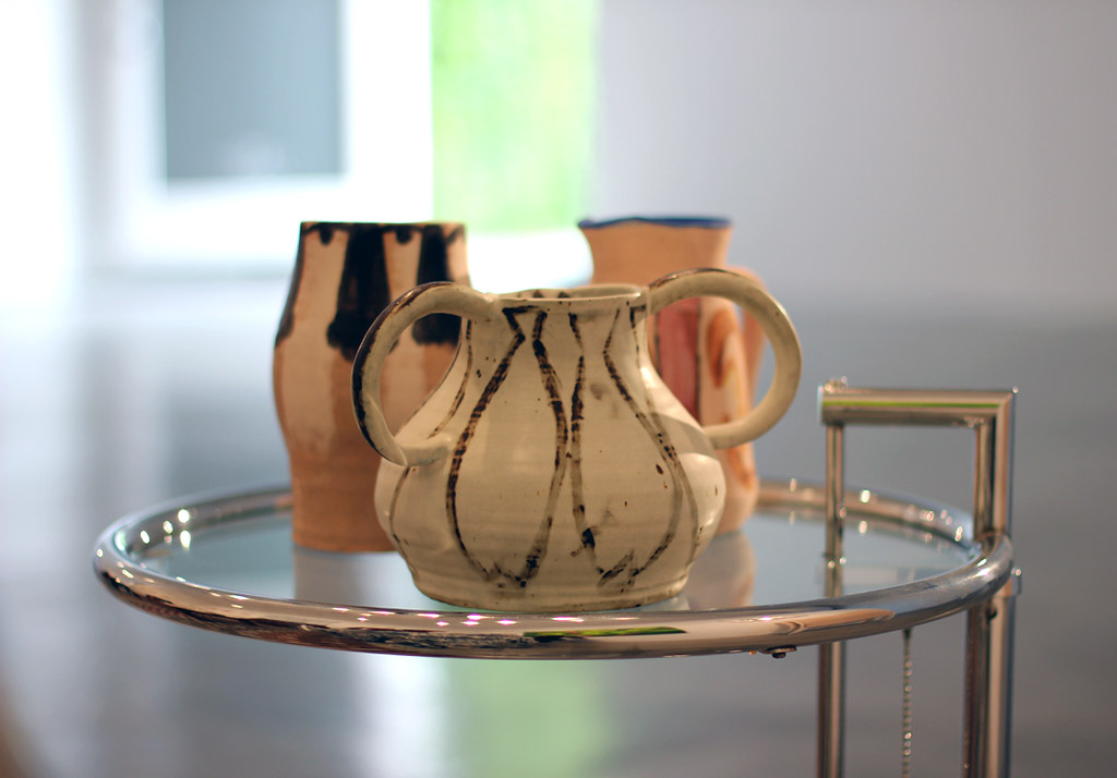
Lisa Jo 2011, ceramics, on Eileen Gray Chrome and Glass Occasional Table by Eileen Gray 20th Century chrome plated metal, round inset glass top
"Synesthesia is created from a set designer’s point of view – it is the assemblage of furniture, art and objects in an environment that has the ambition to look truly personal, but is in fact completely artificial." Can you talk about what his point of view is? Who is this character's space you created?
D: I am not a collector, I don't own anything and my house is basically a bed and one closet. The idea of owning things sort of scares me. However, SYNESTHESIA has allowed me to assume another identity and therefore to deal with those fears. Of course, sometimes as a gallerist, I am scared of giving away pieces that I like so much. I often don't know where they are going to end up. Sometimes I do question the sincerity of a collector. Is he/she speculating? Is he/she showing only their financial power? Does he/she really care about art?
In the specific case of SYNESTHESIA, by choosing varying artworks and various props we also tried to push the visitor to try to guess who the character could possibly be. The choice of props, artworks and designers can confuse one. One doesn’t know if the character is a woman who wears Yves Saint Laurent clothes, or a man who is dating her. He/she is religious? Why then would this person hang a portrait of Christ next to a hustler painted by Antonio Lopez? Again, all we want is to stimulate the viewer, on both on a conceptual and aesthetic level.
By creating this environment, I am questioning all those issues. The idea of the show comes also from the work of Italian poet Pier Paolo Pasolini. He once said in his essay "Gennariello" that making movies was his only way to combine his interest in literature (through the script), painting (through the storyboard) and the only way to play with objects: it took him months to find the right cup of tea for his last movie "Salo", a frightening "mise en scene" of torture in the fascist era. That cup is so important in the movie and it perfectly represents the taste of the little bourgeois mentality behind the raise of fascism in Italy.
J: In the beginning, Daniele and I struggled with defining a specific character that we and viewers could refer to. We soon realized thereafter that it would be best to not base it on a single person but rather draw inspiration from a number of characters, fictional as well as real. I wanted to create an eclectic environment, in terms of styles and periods, much like the apartment of Yves Saint Laurent and Pierre Berge. I also wanted to have some aspects of perversion, vanity, and ego that I related a lot to Carlo Mollino. During the assembly of the show I was channeling Jean Des Esseintes, the main character in Huysmans' A Rebours. Des Esseintes is a the last living member of a noble family and becomes so disgusted with his decadent life in Paris and decides to move to the countryside to spend his life in intellectual and aesthetic contemplation. Each chapter of the book goes in depth about his neurotic assembly/curation of his house and his objects - his vast library, his garden of poisonous flowers, his wall of perfumes…
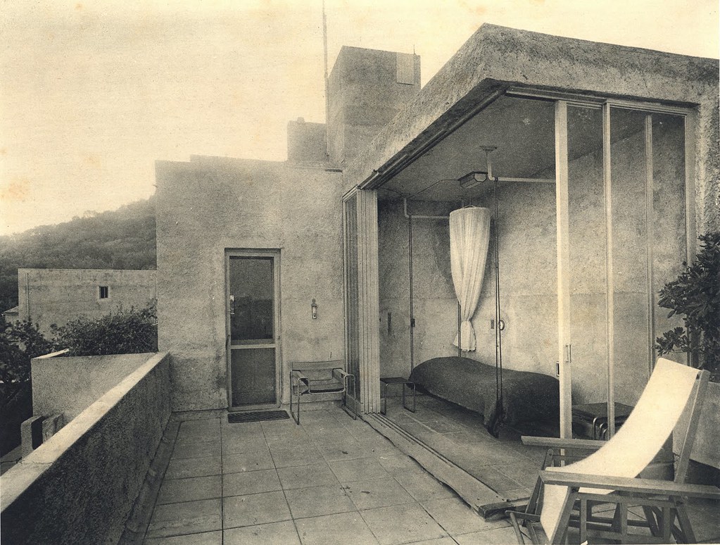
"Villa Noailles, Outside bedroom, Hyères by Robert Mallet-Stevens, 1928."
The villa Noailles features as one of the very first modernist style buildings constructed in France. Designed in December 1923 and inhabited from January 1925, the original villa was built for Charles and Marie-Laure de Noailles by the architect Rob Mallet-Stevens and exhibits the founding tenets of the rationalist movement: practicality, a purification of decorative features, roofs, terraces, light, hygiene...
When did you first become interested in Robert Mallet-Stevens, and why is his work/life of interests to you?
Daniele: The idea of the exhibition came way before I actually thought of Robert Mallet-Stevens. I always new I wanted the show to be a movie set so I started doing a research on and studying the history of set design in the movie industry. That’s when I discovered this amazing text by Mallet-Stevens in which he lists all the elements in order to make the perfect set. One of the elements is dedicated to the kind of art that should be featured in a movie set - in his opinion art in a set should be simple, rarely figurative and should not draw attention away from the actor. Being an anti-academic by nature, I did not respect his rules and, along with Jay, we just decided to set up our own environment. The final result is a set but no actor to focus on, only a character to imagine and the environment to build around his/her absence. The fact that Mallet Stevens was so interested in movie and set design also strongly motivates me to do this show and keep the idea of building a movie set until the end.
Jay: The first time I heard about Mallet-Stevens was when Daniele forwarded an excerpt from his 1926 lecture at the Theatre du Vieux Columbier. Upon further research, I found out that one of my favorite Man Ray films (Les Mystères du Château de Dé) was inspired by and filmed at the Villa Noailles, a house that Mallet-Stevens built for the art patrons Charles and Marie-Laure de Noailles. It was one of those serendipitous discoveries that once learned, one doesn't know how one lived without knowing it before.
Everyone is always so quick to refer to Le Corbusier as the great architect of the Interbellum, but Mallet-Stevens was just as successful and influential as Le Corbusier during this period. Mallet-Stevens just fell into obscurity because he ordered that his archives be destroyed upon his death. Mallet-Stevens was an extraordinary holistic thinker, and as I come from a background in Anthropology, that really resonates with me. Throughout his career he was always highlighting the connections and relations between the various arts, discussing how they each influenced enhanced each other. This is most apparent not only in his writings but his history of assembling various artists, musicians and craftsman in order to collaborate on projects all together.
“Modernist bench in the style of Robert Mallet-Stevens 20th Century painted wood.” Is this the sort of work that Mallet-Stevens was making? Why did he fall into obscurity?
D: When Jay found the bench I realized at which point he understood my point of view about the show. It's not a piece by Mallet-Stevens but rather inspired by him. This object illustrates so well my interest in how layers of reference can inspire the concept behind the construction of an object.
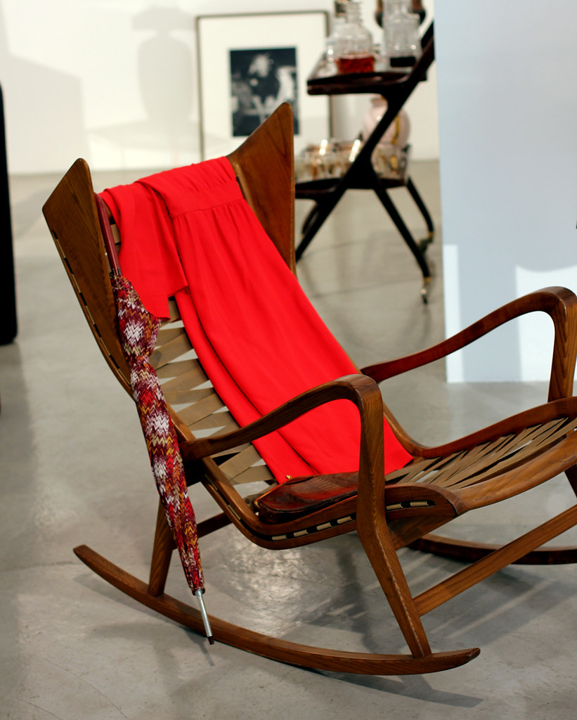
Gio Ponti Rocking Chair 1955
Walnut, leather, upholstered cushion
Walnut, leather, upholstered cushion
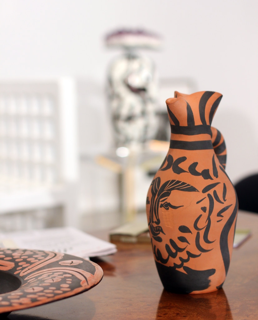
Pablo Picasso, Yan Barbu (AR.513), 1963,
with Alexander May, Eye Fit, 2012 in background
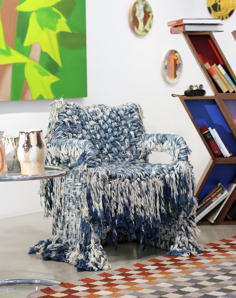
Lucy Dodd "Oceanic Carnage" 2012 cotton and pigment on Breuer chair frame,
with Missoni Maset Rug
with Missoni Maset Rug
It appears the center of Synesthesia is "Lucy Dodd's Oceanic Carnage 2012 cotton and pigment on Breuer chair frame." It represents this tension, of decorative arts and design. Our symbolic actions of placing design objects on a shelf, and art on a pedestal. Synesthesia appears to be about "the character of the collector" as much as it is about the connection of the decorative to the artists. Any thoughts?
D: Lucy's piece truly reiterates my concerns regarding the relationship between art and design that you are referring to. Personally, I have begun to notice an increasing interest by artists in making design. I am not sure where that comes from, but the trend is definitely there. In my Paris gallery I am currently showing a table, glasses and plates, and a chandelier made by Oscar Tuazon and his brother Elias Hansen. It sounds like design but it's actually pure and straightforward sculpture. Very simply, I believe artists are questioning the relationship between viewers and the objects that they are creating. The idea of building something that can be touched, used, reproduced (even only theoretically) is something challenging and new. We are used to looking at art as untouchable object. We are there in front of a painting, a sculpture or a photograph; we have to be passive in front of it and just deal with it. I think (good) artists are questioning that sort of situation by exploring design as a new way to connect to their public in a more physical, concrete and pragmatic way. This being said, I also wanted to create an allegory about the idea of collecting both art and design as trophies. At the end of the day, most of the artwork sold in the market doesn’t end up in a white cube museum space, but rather in private spaces, shown as symbol of richness and power. That’s nothing new. The difference is that Popes and Kings commissioned art for a public purpose, whereas today the experience of collecting is a more private experience. And of course quite often art ends up being exhibited next to a piece of design.
J: And all this time I just liked it because it was just so simply "pretty"! The statement made about the "symbolic actions of placing design objects on a shelf, and art on a pedestal" is very interesting to me because it is an observation I make quite often when in people's homes. People have the tendency to covet fine art more than decorative art because fine art serves absolutely no literal utility and perhaps the ideas of touch, use, and wear make people devalue the decorative arts. That's why I was so pleased to do SYNESTHESIA - not only because of its interdisciplinary context but also because we were able to display truly stand-out design pieces such as ROLU's Nature / Nurture bookshelf. That piece is just as much fine art sculpture as it is a functioning design piece. I really appreciate when collectors, or galleries and museums for that matter, display decorative art objects or design pieces just as they do fine art - perhaps alone in one single room, with nothing else in the eye's view. Returning to your comments on Lucy Dodd's chair, many people's reactions to it were as if it was fine art - they didn't want to touch it, they didn't want to sit on it, they literally did not want it to have a function, and they loved and valued the piece that much more, because of its assumed inutility.
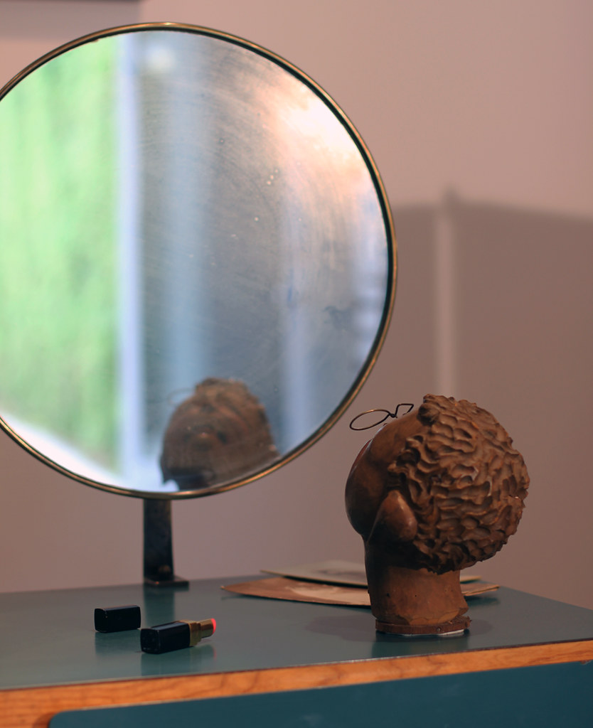
Gio Ponti "Vanity from Parco dei Principi of Rome" 1960: Formica and wood, mirror in brass, with "Anonymous Japanese Marionette Head" of Carved Wood ca. 1900
carved and painted wood, brass wire
carved and painted wood, brass wire
A L.A. dealer once told me that in France in the early 20th century, dealers did not separate decorative art and fine art. They would be represented in the same gallery. It seems that we are slowly returning to that, even as larger dealers such as Blum and Poe are showing ceramicists such as Shio Kusaka, etc. Thoughts?
D: Don't you think there is a lot of shallow "fine" art that is very successful and has only one purpose, which is to decorate? I believe, however, very few artists can use a "decorative" strategy in order to send a groundbreaking, and somehow political, message. On the other hand, there are designers I really find much more interesting than a lot of successful artists. If you take the work by Martino Gamper for example, including the pieces featured in SYNESTHESIA, you will realize at which point he is influential to a lot of artists on both a conceptual and formal way. I would say at some point you just feel like you want to show good things. My dream is someday to create a hybrid space, where different disciplines can be mixed up. A gym for brains!
J: SYNESTHESIA is interesting because of its replication of Mallet-Stevens' holistic attitude. I imagined him at the Villa Noailles, hosted by the Vicomte and his wife, and surrounded by all those artists such as Man Ray, Dali, Balthus, Poulenc. The architect, the artists, the musician all together picking each other's brains, sharing ideas, being influenced by each other, collaborating. Then you go into a gallery some years later and see their work without the history, the influences and all the other artists that played a part in those pieces that are on display. And that's why the preparation for SYNESTHESIA - speaking to all the dealers about each piece - was one of the most interesting aspects of the show. Show's like Synesthesia allow one to expand their knowledge and create a narrative. Almost all of the pieces in SYNESTHESIA, whether it be furniture or art or an object, have some kind of connection to each other- literal connections, subliminal connections, unintended connections. And of course there are also the connections we imagine and narrate in our heads when looking at all the pieces together. That’s much more invigorating than separating the pieces.
Any famous collectors that have personally intrigued you, and why?
D: No doubt about it: Yves Saint Laurent for his voracious need of accumulating things. His massive auction really was an incredible experience. Just a big amount of amazing historical pieces sold next to everyday objects that acquired value just because they were once owned by a successful yet controversial fashion designer. I don't think anyone would be able reach the same amount of drama around such an event.
When it comes to living collectors I have to say, I like all the ones that have a taste for risk, the ones that buy things that are rather difficult to catch at the beginning. When collectors show their muscles and their money I get confused.
Will you speak about your personal interest in different periods of decorative art? Are there any that you find yourself focusing on? Why?
D: My interest for decorative art is purely sociologic and historical. When I am interested in a particular historical moment, I study it from all facets - film, art, design, fashion or architecture produced in that era. I kind of get obsessed for a few months!
However, when it comes to Synesthesia, I wanted to mix up things from different historical moments: from all those obsessions of historical eras I have had the past years. I also have to name as an inspiration for this show Nina Yasher, the owner of design gallery Nilufar in Milan. I met her for the first time last year in Italy and fell in love with her incredible way to mix up art and design from different periods, in such a natural and brave way that breaks any possible codes: she is a revolutionary in her way, a visionary on my opinion.
J: I am extremely fascinated with campaign furniture. I have always been obsessed with dismantling and reassembling things and I adore objects that can be folded or expanded. I have been sketching some new pieces myself, in contemporary styles, a table that folds into a briefcase, a walking cane that turns into a chair. My preoccupation with this comes from my work - I spend most of my days on rather small construction sites so I am always looking for a surface to open up plans on, a chair to take a break on and that I can just carry back home with me at the end of the day. I really want to create a line of campaign furniture for the modern travelling Renaissance man - a stool for sketching in a museum, cooking equipment for a camping trip, toiletry chest for air traveling.
Also, I have been reading up a lot on post-Internet art the past few years and I am interested to see how virtual/artificial realities will make their way into the realm of decorative arts and furniture design.
"Creating a neutral environment where pieces of art and furniture of differing values and time periods are set beside each other also experiments with our perceptions of value and worth of objects."
J: A truly beautiful eclectic space doesn’t mean that it has to be visually pleasing It means that it messes with people’s perceptions and of value and forces them to look upon the new not with fear or rejection but with intrigue and hunger. It forces them to take a second look at the old and reconsider it. It trips people up. Why is the Picasso ceramic in the ROLU bookcase? Who is Hadrien Jacquelet and why is he beside Antonio Lopez, Paul P., and Carlo Mollino? What is “worth” more – the original vanity table by Gio Ponti or the deconstructed Carlo Mollino chair that was reconstructed by Martino Gamper?
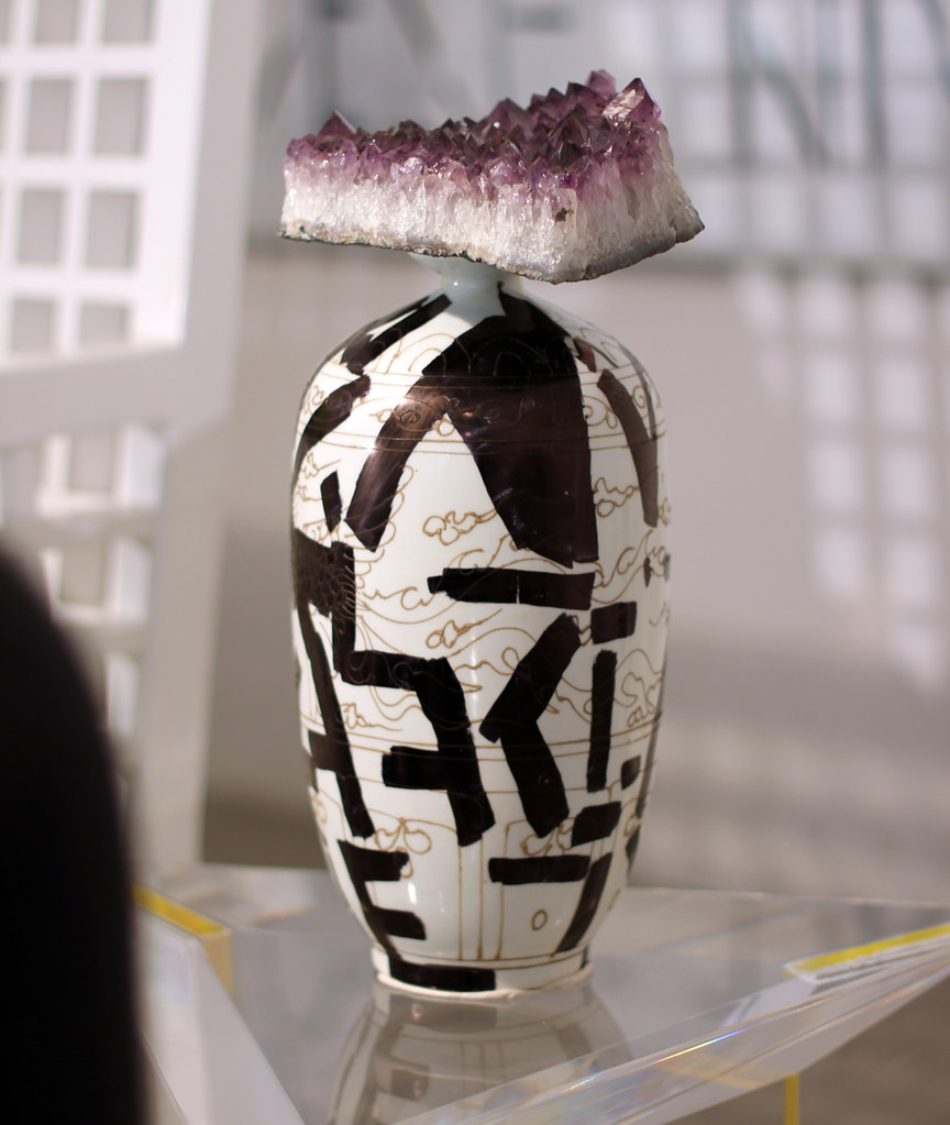
Alexander May Eye Fit 2012 vase with amethyst crystal
I'm particularly interested in Alex May's work. Does he have a show coming up at Galerie Balice Hertling?
D: Alexander May is a very young artist I met last year in New York and decided to show right away. His practice involves sculpture, drawing, painting and performance. His main interest lays in building alternative forms of language: some of his work are text-based pieces based on the deconstruction of the text itself. What really I find relevant in his work is his strong approach to the issue of language and its meaning today. Lots of artists have been working on the same issue on a more conceptual way, but in his case he can add a more physical approach to this topic. His first solo show will take place in September in our Paris gallery, and will feature a series of new paintings and sculpture.
Daniele are you opening a gallery in NY this year? What part of town, and tell me more about the space?
D: I actually already opened the New York gallery in September 2011 with my business partners Alexander Hertling and David Lewis. This is sort of a child dream coming true I have to say - I still can't believe it happened. The space is located in Hell's Kitchen, in Midtown, a block away from Broadway and Times Square. The decision looked quite odd to a lot of people, but for me this area stays somehow real; it's touristic and quite hard at the same time. We are the only gallery in there for now (although in September 2012 things will change with arrival of two spaces). The gallery is located in the Film Center building - an amazing art deco building, with a crazy entrance hall and colorful floors. The building hosts small movie production companies, actor agencies, Broadway dance companies, recording studios – which makes me realize - I have once again fallen into the realm of fiction.
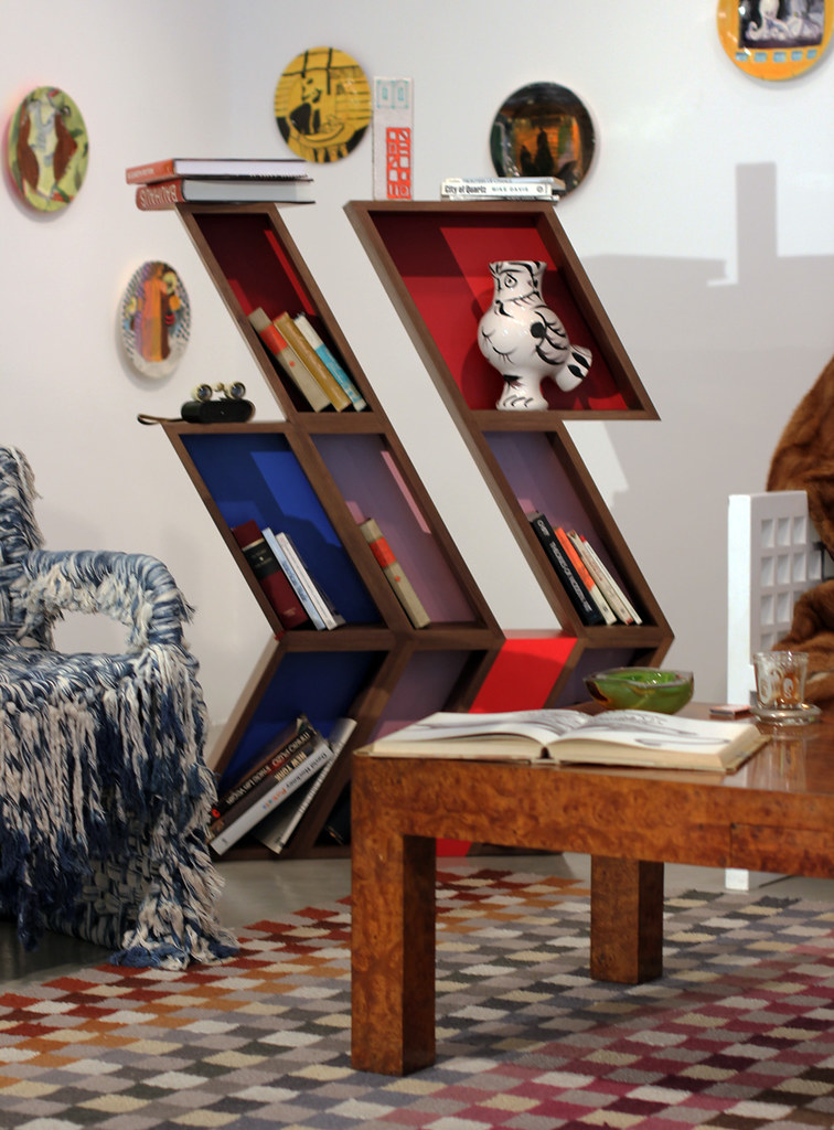
ROLU Nature / Nurture (after Otto Herbert Hajek) 2012
walnut finished with Brie wax and pink, red, and blue laminate
Synesthesia : Curated by Daniele Balice and Jay Ezra Nayssan 29 Jun - 31 Aug 2012
M+B : 612 North Almont Drive : Los Angeles, California 90069

