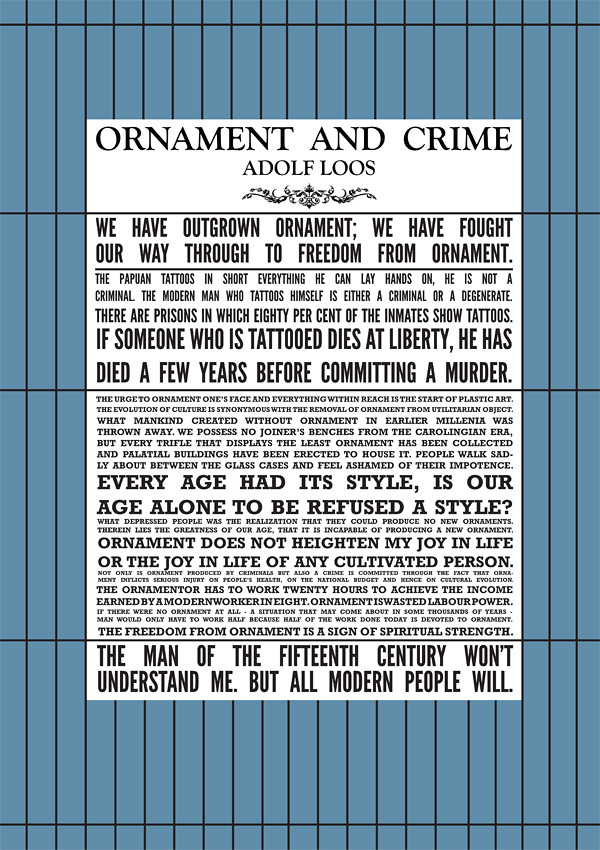
we have fought our way through to freedom from ornament."

Lately, I keep coming back to the works of Adolf Loos, and Charles Rennie Mackintosh. The love of the grid, the line, and the idea of simplicity kept them strong. A hundred years later, their works are more relevant than ever, standing tall, presenting the grid to a new generation. Their attention to detail (or lack of, depending on your viewpoint) and to color, or lack of color is devastatingly beautiful on all accounts. Welcome to 1910....
- David John
-----------------
"The house should be like by all. Unlike a work of art, which does not require anyone to like it. The work of art is the private affair of the artist. The house is not.... And thus I love the house and hate art."
Adolf Loos, Architektura ('Architecture'), 1910.

1930 March 4th, 1930, Villa Müller building is completed
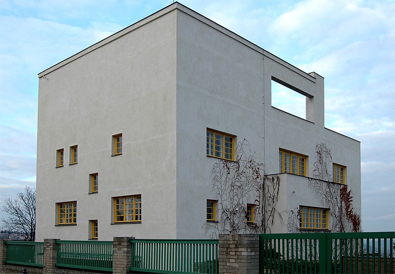
"Adolf Loos himself designed the interiors, including the light fittings, the fitted and some of the non-fitted furniture. He himself said of the house that it was his most beautiful, and spent his 60th birthday there in the company of a close circle of friends. It was here that he was most perfectly able to embody the ideas of his 'Raumplan'. The severity of the external facade, composed with a refined balance in the asymmetric symmetry of the window apertures, contrasts with the noble elegance of the interiors, even in the ostensibly secondary spaces."
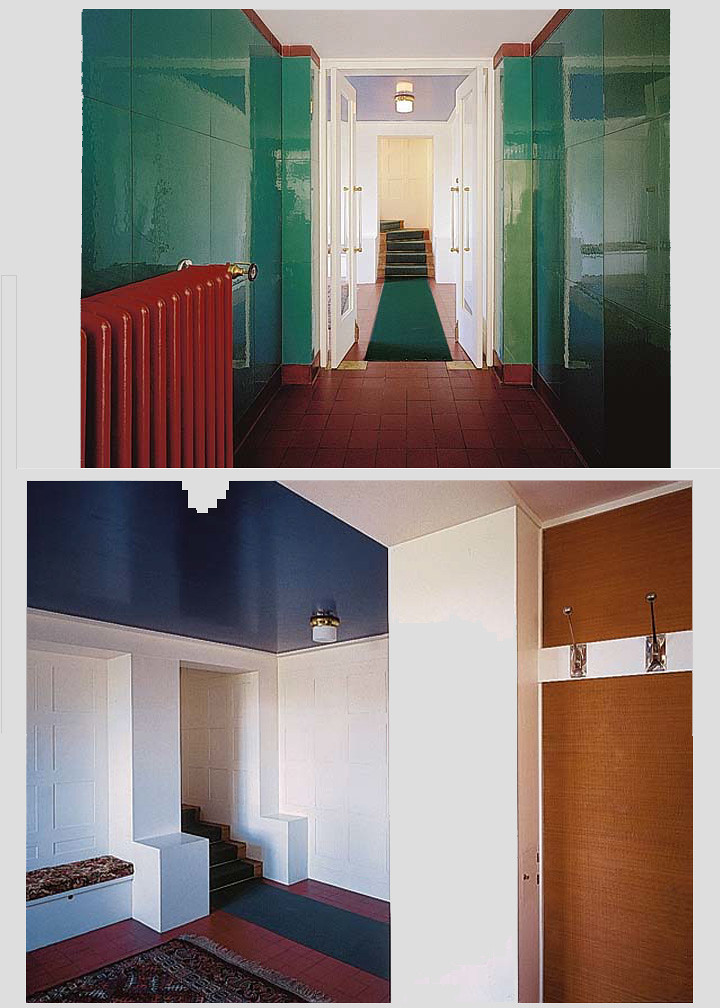
Green Corridor: "The corridor is arresting with its unusual polychrome harmony, green-tinted opaque tiles and the deep terracotta colour of the floor and the frieze below the ceiling. The red radiator is deliberately set in a conspicuous location. Loos felt that technical elements should be not only part of the functional fittings of the house, but also deserved to contribute to the overall aesthetic appearance of the interiors."
Blue Ceiling: "Here too there is an interesting play of contrasting colours: the floor tiles are the earthy colour of terracotta, while the wooden panelling of the walls, with the repeated square motif known from others of Loos' interiors, is painted white. The colours of the space are rounded off by the surprisingly deep blue ceiling, the colour of an early evening Venetian sky. The hall includes a cloakroom with pegs and a mirror, set into a broad niche with Japanese hangings."

"The house should be like by all. Unlike a work of art, which does not require anyone to like it. The work of art is the private affair of the artist. The house is not. The work of art is sent out into the world, without anyone needing it. The house fulfils certain requirements. The work of art is not answerable to anyone, the house to everyone. A work of art seeks to draw people out of their comfort. The house should serve comfort. The work of art is revolutionary, the house conservative. The work of art shows humanity new paths and thinks of the future; the house thinks of the present.
Man loves everything that serves his comfort. He hates all that seeks to draw him from his customary and secure state, and all that constricts him. And thus I love the house and hate art."
Adolf Loos, Architektura ('Architecture'), 1910.
"Among his pioneering acts was a radical departure from the Secession and all figural and ornamental decoration, which of course he replaced by the natural structure of selected stones, wood and other fine materials, and the entrance of the term "Raumplan" ("spatial plan") into architectural practice. Despite his character of social feeling he was not an advocate of social experiment through architecture, but through his works prepared the way for Constructivism and Functionalism."
images and text taken from here...
-------------------------
