Y H B H S (card catalog) selection 42....

David John,
designer, author of YHBHS, los angeles....


Life today is the P R E S E N T, if you can begin to take it."


Louise Bourgeois, June 23, 1975


-----------------


To choose one book that has inspired you is not an easy task. Shelves of design books, art monographs, and vintage furniture catalogs galore, and I can only choose one! Ugh. My mind has gone around, around and around in circles. I finally decide to go with my gut instinct. The artist & book that gave me the courage to seek my own path,


Louise Bourgeois

Destruction of the Father, Reconstruction of the Father
Writings and Interviews 1923 - 1997


Louise Bourgeois' writings and interviews have given me more insight than perhaps any other designer/artist. On my down days, I can open the yellowed pages and sink into her explanations and defenses of why she created work for 70 plus years . Every time, I'm instantly grounded.

Not understanding why you make work can be a CREATIVE DEATH. Buckle up, young travelers. She's gonna take us along for the ride! Bourgeois survived, and thrived, and this book gives you the insight as to how and why she made the work she did.


"Through self-knowledge we recognize and understand the mechanisms of our fears. We cease being dependent on the unknown and the acting out stops.
The goal is to become active, and to take control.
Until the past is negated by the present, we do not live."

-Louise Bourgeois


To quote this book is almost impossible, because there is far too much to quote. This is not a coffee table book full of gorgeous full page spreads. In fact, the images contained are scarce and small. This book is a fuck off to the art world, her family, and others that have stood in her way to find her own VISION / PATH. It's packed with self doubts and determination, and an unrelenting desire to be understood and liked. Don't we all just want to be loved and adore?


Je t'aime, 1977, red ink on grid paper


"Beauty? It seems to me that beauty is an example of what the philosopher's call reification, to regard the abstraction as a thing. Beauty is a series of experiences. It is not a noun. People have experiences. If they feel an intense aesthetic pleasure, they take that experience and project it into the object. They experience the idea of beauty, but beauty in and of itself does not exist."


-Louise Bourgeois
from a conversation with Bill Beckley, 1997


-------------------


Last year, early summer, Louise Bourgeois passed away due to a heart attack at the age of 98. I wish I had been able to tell her thank you, but it's never too late, right?


January 12, 2011
Dear Louise,

Thank you for sharing your beauty. Thank you for inspiring me to search for beauty where I least expected to. A certain beauty is all around us, constantly shifting, though some will never see it. I've come to realize as you have, that beauty is a series of experiences. Objects are not beautiful in themselves, they need us, and our input. Objects will never become beautiful, unless we are able to connect the stories, the histories, and share our thoughts. Then, they will become beautiful. And so, I search for the people, and the stories, further. Day in, and day out.

You opened my eyes, but more importantly my heart.

Thank you. Thank you. Thank you.

X
David John


------------------------------


I began You Have Been Here Sometime in November 2008. Desiring a change in my career path, I started a blog to document art/design I admired from afar. I had absolutely no idea the amount of creative, dedicated friends & colleagues I would meet. The site has pushed and pulled me in the most fantastic directions.

I am in the process of completing a Master of Interior Architecture at UCLA, and working at a residential design firm in Hollywood, CA, and working on my own projects. A sincere thank you to all the people that contributed to the YHBHS Card Catalog. I was truly overwhelmed with the response I received from this project. Perhaps next time, we take on a design object or art piece? Happy 2011.


want to email me? please do so!
mrechopark at yahoo dot com


--------------------------------

Y H B H S (card catalog) selection 41

Glenn Lawson, designer, Los Angeles
"It wasn't just well-edited, it was real. The moustached prince lived like that and so, I thought, why couldn't I? "


The Power Look At Home: Decorating for Men

by Egon von Fürstenberg


Glenn Lawson
writes, "As a closeted teenager in a very small town in Wisconsin, my only outlet for erotica was the local library. One day I stumbled upon von Furstenberg's first book "The Power Look". It was supposed to be a men's guide to style, but it was really just soft core homo-erotica of the best kind.

His advice ranged from do-it-yourself "silk scarf belts" to keeping fit by taking jazz dance classes. Egon was a prince and
his stories of jet-setting around the globe intertwined with the most ridiculous "fashion" tips was right up my alley. The pictures were of men around the world in crotch-hugging ensembles, speedos, or sometimes just white briefs, why not?


When I found his second book, I was hoping for more of the same crotch-shots peppered with stories about private jets and St. Tropez.. Instead I found the most awesomely put together book on interiors I had ever seen. It was more than just a book on interiors. He was selling a lifestyle. Of course I promptly checked it out and never returned it. (Sorry Mrs. Budny!)

He was selling a lifestyle I hadn't even dreamed existed. The colors and proportions ( and all the brass and lucite) turned me on to a whole other world. It wasn't just well-edited, it was real. The moustached prince lived like that and so, I thought, why couldn't I? When I painted my bedroom navy and white and spray painted my dresser gold (just like that townhouse in New York) I thought I had arrived.

He definitely gave me something to dream about and opened my eyes to an effortlessly chic style of decorating. I still have that tattered copy and its pages still inspire me.


Glenn Lawson is a designer living in Silver Lake, California. Lawson-Fenning is located both in Hollywood and Silver Lake. In the back ofthe SL Lawson-Fenning is Ivanhoe Books. The best place on the East side to buy art/design/architecture, and vintage books!


------------------------------
Y H B H S (card catalog) selection 40

Bree Claffey of ii-ne-kore , Australia


Master of Go by Yasunari Kawabata.


Bree Claffey writes, "My book is not a design book, but a novel. I love his book Snow Country as well. But I chose this book for your list. I love the quiet and space in his prose, and the poetic imagery are beautiful, particularly to do with his characters, and the way he uses descriptions of scenery and seasons. He often deals with the tensions between old and new.


I embrace modern Japan, and cannot obviously relate to his deep yearning for the way of the old. But that tension, and the interface between tradition and modern is one of the most fascinating things about Japan and its culture, for me."


"In addition to remaining true to traditional forms, Kawabata often focused on retaining traditional culture in the face of the modern world as the subject of his fiction. He presented and defended such traditional Japanese forms as the tea ceremony in Sembazuru (Thousand Cranes; 1952), the game of Go in Go sei-gen kidan (The Master of Go;1954), and folk art in Koto (The Old Capital; 1962). Kawabata wrote in a style similar to traditional Japanese haiku poetry, known as renga, or linked poetry. His work is filled with imagery and symbolism." from here...


----------------


Bree Claffey
BA (Philosophy), University of Melbourne MA (Publishing and Editing), University of Melbourne. Her blog ii-ne-kore is a constant source of inspiration for me. She now has a shop and gallery in Melbourne called, Mr Kitly, full of fantastic things & art! can't wait to check it out in person!

MR KITLY :UPSTAIRS : 381 SYDNEY ROAD, BRUNSWICK


----------------
Y H B H S (card catalog) selection 39

David Grey, educator and designer, high desert, new mexico

"For anyone who embraces our desire for storytelling and the act of learning how to see, I could not recommend a more lovely book."


Maps of the Imagination
by Peter Turchi
(Trinity University Press, 2004)


David Grey
writes, "As a graphic designer and educator, I am forever intrigued by the artist’s ability to make creative connections. We are incessantly putting together a puzzle in which the pieces continually evolve. We create and curate simultaneously, or, as Peter Turchi writes, we take on both the role of Explorer and Guide.

The first time I read this book, I was living and teaching in upstate NY. It was a Saturday, midwinter, 9am. I began reading and before I knew it, the sun had set. By noon the next day, I had ordered 4 copies to share with friends. I was in awe. I was giddy. And most of all, I felt as if someone had expressed my curiosities in the most elegant of manners and presented it as an exquisite object (the book is beautifully designed by DJ Stout of Pentagram).

My love of wandering, and my deeply rooted need to dissolve the barriers between physical and creative exploration were not only justified, but expounded in the most poetic of ways. For anyone who embraces our desire for storytelling and the act of learning how to see, I could not recommend a more lovely book."


------


“While our perspective and understanding are undeniably limited, in some sense we each have the world — or we each have a world, one that includes not only our hometown and our favorite vacation spot but Victorian England, volcanoes we have only read about, and Vietnam, which has a place in our mind even if we can’t find it on a globe. We compile mental maps that are wildly skewed, a mental atlas so large and complex that we can never fully convey it to anyone else. Then we live in the world those maps create.” - Peter Turchi


Surprise jolts us into a state of heightened perception, and so opens us to the possibility of new understanding.” - Peter Turchi


--------------


David Grey
is an educator, graphic designer, and occasional photographer. Chair, Graphic Design Dept., Santa Fe University of Art and Design; and Founder, Sun Mountain School of Contemplative Art. He is also the publisher of Cottage Scholar.


------------------------
Y H B H S (card catalog) selection 38

Will Schofield of A Journey Round My Skull
"I imagined a line of spiders, creeping along...."


Signature : Patterns in Gond Art
Featuring various artists Edited by Bhajju Shyam, Gita Wolf and Jonathan Yamakami


Will Schofield
writes, "I'm fascinated by how many of the "signatures" of the Gond artists are abstractions from nature -- "I imagined a line of spiders, creeping along" or "This is the pattern that a cow makes on the earth with her hooves" -- and how these signatures become little building blocks for larger patterns and images."


--------

"From established artists to emerging talents, Signature features an array of Gond patterns. Gond artists hail from Central India and work with an older tradition of drawing on walls and floors. Yet these artists mark their work as their own with carefully chosen patterns. A valued symbol of memories and stories, the Gond pattern is at once contextual and universal."


Will Schofield
is the author of the most fantastic site, A Journey Round My Skull! Read a fantastic older interview here where he states : "I've always been able to talk to friends about music, but I didn't really connect with people who read the strange books I read until I started blogging. Blogging about book covers made me more aware of graphic design, which slowly morphed into a focus on visual ephemera. In the past year, more than 50 percent of the posts feature material I wouldn't have discovered unless I was blogging." Thanks Will!


------------------------
Y H B H S (card catalog) selection 37

Giovanna Parolari, UNA and The Best Time of Day, Portland

"I can't remember the first time I bought either one, but I know that the obsession and feeling of "rightness" lasted a long while. I knew that they were special but I didn't really know what i was absorbing at the time- how fantastic and forward both were."


INDEX & NEST magazines.


Giovanna Parolari writes: "I grew up in a small town in the Central valley of California. Luckily my parents drove us all over the state--- used bookstores, antique stores, author's homes and gardens. I felt such a connection through these magazines.

I can't remember the first time I bought either one, but I know that the obsession and feeling of "rightness" lasted a long while. I knew that they were special but I didn't really know what i was absorbing at the time- how fantastic and forward both were. I still have a stack of INDEX magazines. Unfortunately I tore apart the Nests years ago to put in the files.


Graphis Packaging 3 (1977)

"I picked this up at a thrift store along with a couple of the annuals from the 70's and then forgot about them for awhile. I started in on them again recently, the packaging book is perfection. I find a new treasure each viewing, a little detail or design i missed before."


----------------


Giovanna Parolari lives and works in Portland. Her store is UNA. 2802 SE Ankeny, Portland 97214. Her site THE BEST TIME OF DAY is one of the sites I read daily. There is something magical in the works she chooses to show: a strong attraction to geometry, forms, textiles, and a European perspective on interiors. I'm hoping to make it to Portland to visit UNA this year. Finally!


-----------------
Y H B H S (card catalog) selection 36

Rodney Hill
, gallerist, Los Angeles
"These 3 books have stirred memories of my little corner of the pre-internet universe; Detroit in the early 1980s, where I was exposed to some pretty great forms, textures and volumes."


When Rodney Hill responded to my email asking him to pick his favorite book for YHBHS, not only was I flattered, but I was psyched to see what he would choose! Rodney has turned me onto so much art & design that it's just plain ridiculous. He's the type of enthusiast that sends emails of Italian lamps on auction at 3 a.m... Yes, to know him is an honor and an education in design, passion, and generosity.

The email that I received from Rodney Hill reads:


On the last day of holiday vacation, I share three books that have been at close at hand lately and have became knotted together in my mind. These 3 books have stirred memories of my little corner of the pre-internet universe; Detroit in the early 1980s, where I was exposed to some pretty great forms, textures and volumes. I frequented Linda Dresner's amazing boutique (www.lindadresner.com) where they stocked asymmetrical, origami-like Japanese fashion from the start. Meanwhile, wedge shaped, stainless steel DeLoreans with gull-wing doors were on the streets. Nearby, John Portman's "Renaissance Center," a reinforced concrete lobby with conversation pods and a monorail, offered 73 story glass elevator rides.


Juliaan Lampens
, 2010
Angelique Campens, Hans Ulrich Obrist, Sara Noel Costa de Araujo,
Jan Kempenaers, Francis Strauven, Juliaan Lampens

-----------


These impressive designs and aesthetics established a 30 year imprint in my mind's eye of an ideal way of living, impossible to achieve without a serious code of discipline. When I came to know Julian Lampens' work a few years ago, the immediate sensation was of Deja Vu, then awe -- that living with these forms and textures can indeed be intimate and warm.


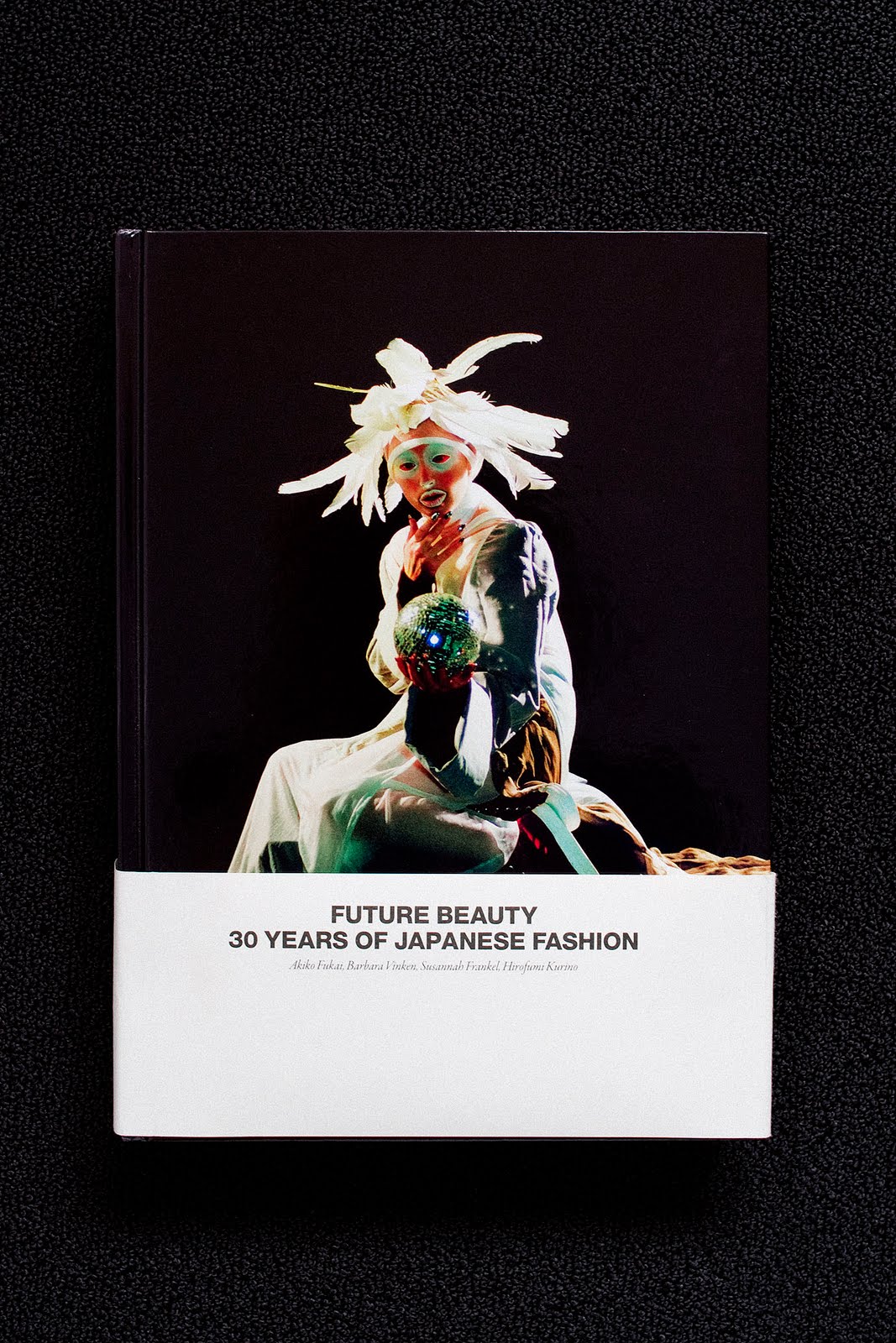
Future Beauty: 30 Years of Japanese Fashion

by Akio Fukai, Barbara Vinken, Susannah Frankel & Hirofumi Kurino


-------------


Seeing 30 years of Japanese fashion further historicized in "Future Beauty" at London's beautiful Barbican Center was a personal highlight of 2010, and its glossy catalog is already a treasure. The exhibition included extensive amounts of the related graphic direct mail and magazine advertising materials. Another treat: a projected video of a very tense audience responding to Rei Kawakubo's "lump dress" runway show, silence, laughter, and a few courageous people clapping to support it. (The show is still up!)


Arthropods: New Design Futures
by Jim Burns 1972, Praeger, New York


------------------


I think the prescient designers in Arthropods: New Design Futures saw Comme des Garcon's "lump dresses" coming. Inside the books foreboding cover graphics, it's full of B&W eye candy and ideas from 30 international environmental designers who were acting against the un-ecological and dehumanizing urban and corporate environments of the late Sixties (!!!???). Arthopods' "understanding of consequences" reads much like "Green movement" propaganda, practices and product placement of today. There's not much in Arthropods for the consumer, just ideas, and very few built works. An architect friend looked straight through "Arthropods" patina, and commented: "Optimistic !", and I think he was right!

I normally spend my time on blogs like this, and Ro/Lu, etc. where I enjoy the gathering community of people interested in circulating and re-circulating these ideas and images, which often send me back to books like these.


Enjoy the pics!"


--------------------


Rodney Hill loves lamps. He is co-owner of Marc Foxx Gallery, Los Angeles. Takayoshi Nonaka is a photographer. He is Creative Director, H. P. France, Los Angeles, New York...


-------------------
Y H B H S (card catalog) selection 35

Mary Manning,
UNCHANGING WINDOW
"dreaming is better than parties...."


Beautiful Thoughts

by Tiny Tim


Mary Manning writes, " This small volume arrived through my front door when I lived in San Francisco. It was sent to me from my very dear friend Frank. You can even see two small dents in the front cover from when my dog used to bite the mail when the post arrived.
It's a very kind and generous collection of messages from funny ol' Tiny Tim. Beautiful Thoughts. Simple.

I have so many books that inspire me but this one came to mind immediately when you asked. It's so funny and graphic and positive. There are classic fonts laid upon technicolor graphics that say things like:


"DON'T INVESTIGATE DARK PASSAGES"


-or-


"DREAMING IS BETTER THAN PARTIES."


Mary Manning
is an artist, photographer, and cinephile living in New York City. Her blog, UNCHANGING WINDOW is a photographic essay of her life: the colors, forms, art & music that inspires her. Last year she curated a show in Los Angeles called, CHUMS, which united real objects among online friends at Space 15 Twenty.


---------------------
Y H B H S (card catalog) selection 34

Davide Balula, artist, Paris, France
"
It's a nice tool for admiring balance and composition, transposable to every other field, beyond just ceramic pots, branches and flowers."


The Art of Arranging Flowers-
A Complete Guide to Japanese Ikebana

by Shozo Sato


Davide Balula writes from the snowy Alps with his card catalog entry:


"That book was offered to me by a wonderful person, and that makes it a very precious element to have around me. It is a real pleasure going through the pages and it's always a great inspiration. The guide is complete and super precise. Completed as well with nice technical explanations.

It's a nice tool for admiring balance and composition, transposable to every other field, beyond just ceramic pots, branches and flowers. Ikebana is a weird thing, the nature is so artificially manipulated to make it look like it is perfect harmony... but only according to the flatness of a photograph.


Snowy thoughts from the alps, DB"


Davide Balula Born in 1978 in Annecy, France. He lives and works in Paris, France. Exhibitions (selection): 2010 : Au fil de l’oeuvre, La Galerie, centre d’art contemporain, Noisy-Le-Sec, France; 2009 : Un nouveau festival, Centre George Pompidou, Paris, France; American Wall Nut, Fake Estate Gallery, NY, USA (solo) ; Return to Function, MMoCA, Madison, USA; 2008: Le Lac, le mensonge, Confort Moderne, Poitiers, France (solo).

http://davide.balula.free.fr
http://www.lappareil.com


-----------------------


Y H B H S (card catalog) selection 33

Keehnan Konyha, 2THEWALLS, decorator, New York


"To my fifteen-year-old self, this was beauty and power. These were people in absolute control of their lives and of how they chose to present them."


" There is an intrinsic and transformative magic in our ability to shape our environments—markedly more so when we are restricted to available materials. "

- Keehnan Konyha


The Essential House Book,
by Terence Conran
Three Rivers Press; First American Edition edition, October 18, 1994


"Living in unsatisfactory surroundings doesn't necessarily promote a desire for change; it can just as easily blunt the awareness of how improvements could be made." (p. 84)


--------------


Keehnan Konyha writes, "I grew up in a trailer park—two, actually—in rural Washington. The second for over a decade, until I moved out at seventeen. As an adult there are innumerable reasons I am grateful for my childhood, but as a teenager, it wasn't ideal.

My mother, a single parent, experienced long stretches of darkness. Periods when rooms would become so saturated with fleas and teeming with garbage they couldn't be opened; when dishes would sit, dirty, for weeks on the floor until they were eventually thrown out. To experience this as an adolescent, already in a state of profound powerlessness, was paralyzing. I was mortified not only by the traditionally unenviable state of my exterior living situation, but by my lack of control over its interior as well.

It's hard to say when Terence Conran's The Essential House Book appeared, though I must have been about fifteen. A Costco markdown gift from my grandmother, shelved with the "good books" and enshrined behind the glass of the MDF-and-white-laminate Levitz media unit that was the only piece of furniture ever purchased new during my youth.


'If anything good can be said to come from economic hardship, it has to be a rejection of the artificial values which accompany an inflated sense of wealth." ( p. 117)


-----------------


I became obsessed, the aspirational nature of interior photography, and the world of shelter magazines in general absolutely lost on me. Here were people, families, living in homes. Not wood-paneled, corrugated aluminum-sided boxes, but cabins, lofts, converted garages. To my fifteen-year-old self, this was beauty and power. These were people in absolute control of their lives and how they chose to present them.

I began to realize that my bedroom was a world I could control. I started to liberate gallons of forgotten house paint from neighboring sheds. I covered furniture from dumpsters in contact paper, began lining drawers and decoupaging chests in tear sheets from old issues of Wired and Raygun. I reupholstered a broken chaise lounge in clearance sale leopard-print flannel sheets from J.C. Penny's using picture hanging nails and thumbtacks.

And I would lie on the floor for hours, The Essential House Book, the IKEA catalog, and a notebook spread out in front of me, designing and redesigning rooms I did not, could not access.


"Homemaking might have a deeply unfashionable ring about it today, but it may be that in mastering the art of shaping a home around our individual and family lifestyle, instead of trying to fit the glossy dictates of magazine and showroom within our own restricted walls, we will rediscover the power of domestic well-being." p. 117


-----------------


The contradiction here is that this isn't a book about decoration. Ostensibly, The Essential House Book is about the fundamental architectures of home, its focus primarily the bones of space, structural function and flow. The elements of pure decoration it contains are superfluous in the scheme of the book as a whole.

For most of us, the anatomical elements of our living space are beyond our control. We live in cramped and poorly aging apartments; we have roommates; we have security deposits and double mortgages. At fifteen, and even now at almost thirty, ripping up the kitchen floor and retiling isn't an option.

What this book taught me is that it doesn't have to be. Decoration is a very real sort of alchemy. Painting an object, a wall, is literal world building; Mod Podge is power in situations where there is little. Even if accidentally, what I gleaned from The Essential House Book is that decoration can never be only about appearance. There is an intrinsic and transformative magic in our ability to shape our environments—markedly more so when we are restricted to available materials.

Viewing these images again after so many years, I find myself embarrassed by the degree to which I've internalized them and their palate of chalky pastels, draped couches and faux-humble mattresses on floors. I look around at my apartment to see rows of shirts on wall-mounted hooks and leopard-print throw pillows, and wonder if I haven't been rebuilding the same room for myself since I was fifteen.


Keehnan Konyha is a decorator based in Brooklyn, New York. Established in 2008, 2THEWALLS is an ongoing experiment in the documentation and representation of interior experience. 2THEWALLS attempts to examine decoration outside the constructs of style, taste, and era."


I received the above amazing letter from Keehnan Konyha last month with his entry for the YHBHS card catalog. Keehnan's site, 2THEWALLS has influenced how I view interiors as much as any design magazine. If you are not familiar with his work, then this entry is a perfect introduction to his thought process and how he views rooms & spaces... His take on interiors and dwellings are triggered by and collaged with memories, emotions, and historical references. Sources galore and rightfully exposed..... Decoupaged-dubstep dioramas of foyers and living rooms. A true collision of art, literature and film... And much more.

Thank you Keehnan for keeping me inspired, and continually thinking of new and old spaces.


-David John, YHBHS


------------------------------


Y H B H S (card catalog) selection 32

Forrest Nash of CONTEMPORARY ART DAILY
"
I carried it around with me everywhere for at least 2 weeks, and it almost single-handedly aroused my passion for contemporary art."


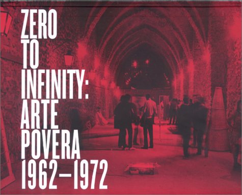
Zero to Infinity: Arte Povera, 1962-1972


Forrest Nash of CONTEMPORARY ART DAILY states, "This is the catalogue to an exhibition called Zero to Infinity, which, in my lifetime at least, was the first and most-major presentation of Arte Povera to American audiences. I ordered the catalog at the recommendation of my art teacher when I was 15, and it had a big impact on me. I carried it around with me everywhere for at least 2 weeks, and it almost single-handedly aroused my passion for contemporary art.

The idea that these things, which I immediately loved, were not only being made but were fodder for multi-million-dollar museums, were things to be guarded by security, that these things were considered extremely high culture, was extremely fortifying and exciting to me. I started taking art seriously and studying it and making it after that. The texts are mostly interesting, but there is a dialogue between Marisa Merz and her friend Bea that really stands out for me."


(text below taken from here...
)

"Zero to Infinity: Arte Povera, 1962-1972" focuses on one of the most innovative and influential art movements of the postwar era. Arte Povera came of age in the context of the economic boom of the "Italian miracle" and the subsequent student and workers' revolts of 1968. The work of Arte Povera was motivated by an urge to revolt not only against the primary achieved by painting in the postwar period, but also against certain aspects of the emerging consumer culture.

This exhibition and its accompanying catalogue provide a highly comprehensive retrospective of the Arte Povera movement as a historical and aesthetic phenomenon that crossed a wide range of disciplines, including sculpture, installation, drawing, and photography as well as film and performance. The exhibition traces Arte Povera's genesis within the artistic, cultural, and political context of Italy to its positioning within the broader international context of postwar artistic practices, a moment marked by the participation of the Arte Povera group in the 1972 "Documenta V" exhibition in Kassel. This brilliant and crucial new catalogue is designed by the Walker Art Center's award-winning Design Department, and includes a wide range of essays by international scholars and curators, as well as rare historical documentation, in an unprecedented re-examination of the Arte Povera movement.


Featured artists include:
Giovanni Anselmo, Alighiero Boetti, Pier Paolo Calzolari, Luciano Fabro, Piero Gilardi, Jannis Kounellis, Mario Merz, Marisa Merz, Giulio Paolini, Pino Pascali, Giuseppe Penone, Michelangelo Pistoletto, Emilio Prini, Gilberto Zorio. Essays by: Richard Flood, Frances Morris, Carolyn Christov-Bakargiev, Robert Lumley, Corinna Criticos, Karen Pinkus, Francesco Bonami, Giorgia Bottinelli, Judith Kirshner, and Germano Celant.


Contemporary Art Daily
: "A Daily Journal of International Exhibitions." One of the best daily updated ART SITES currently on the internet. Hands down! So many images posted here on YHBHS have been directly sourced from Forrest Nash's site. CONTEMPORARY ART DAILY's extensive archives of shows, as well as art venues (from Berlin to Los Angeles) makes it an extremely valuable resource! Every morning, it's the first place I look.....


I look forward to having a conversation with Forrest about art for an upcoming post for YHBHS in 2011. Happy New Years Everyone.
The YHBHS Card Catalog still has about 7 more postings, so sorry about running into January, but there was simply too many excellent books and generous postings from talented people..... I hope that you have enjoyed the series as much as I have!


----------------------