with minimum interference with the existing structure and maximum
perception of the overall volume. "


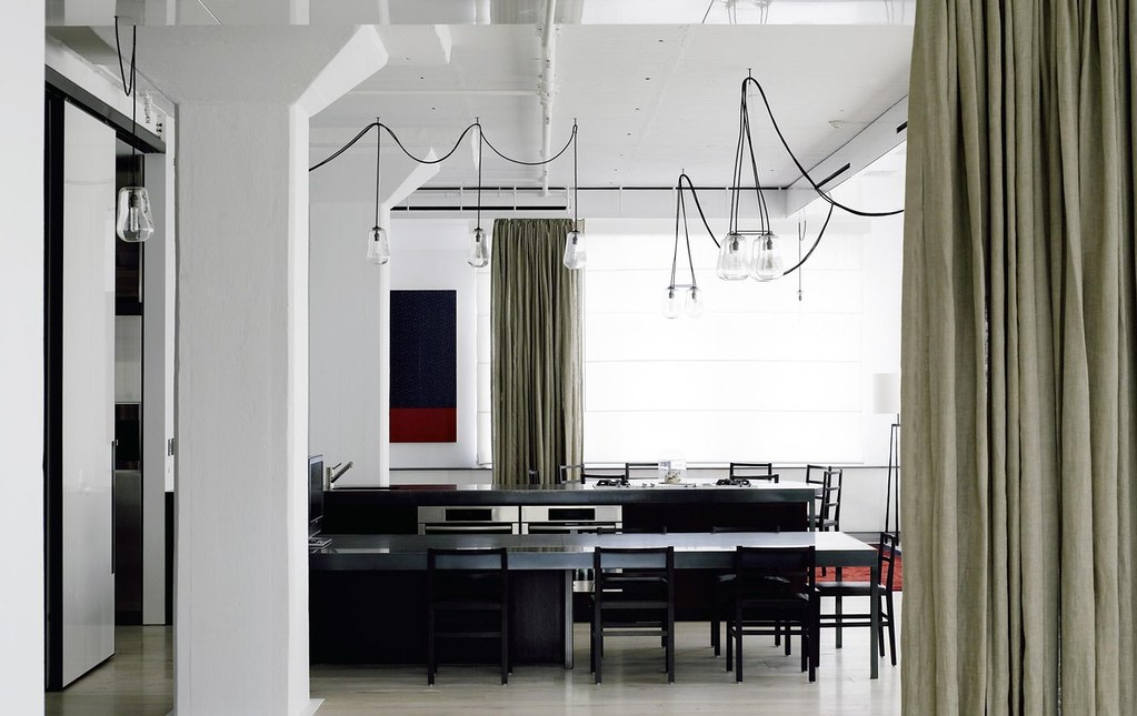
1. Tribeca Loft by Fearon Hay Architects. "The strategy was to provide the required division of space with minimum interference with the existing structure and maximum perception of the overall volume. The insertion of steel framed, glazed volumes with raised timber floors provides elevated sleeping platforms within the loft space. The glazed volumes are accompanied by blank, white, volumes containing bathing, service and scullery functions. These service components are arranged in a linear sequence in the centre of the space. Both of these insertions are carefully placed amongst the existing structural elements of columns, beams and corbels, freeing the structure and the perimeter of the loft from division. Further layering and configuration of the space is offered by layers of operable fabric screens and sliding panels."
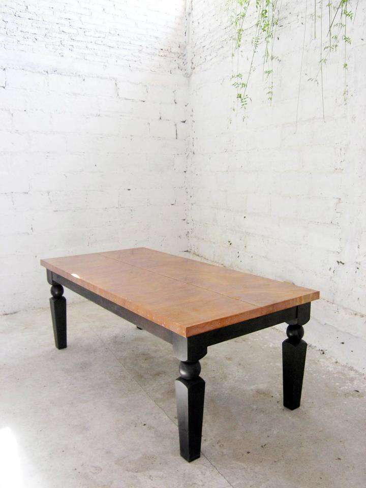
2. Casamidy, Hacienda table
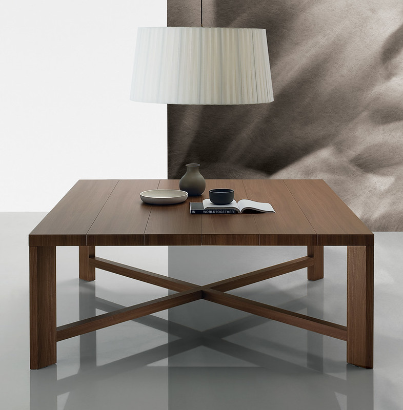
3. Zeus table: Spessart oak, Zeus Design Vincent Van Duysen 2006 Thickness as distinguishing mark, aesthetical rigor as primary characteristic for this table designed by Vincent Van duysen for Poliform
